A cabinetry catalog isn’t just a set of photos. It’s a decision tool. When you’re investing in a kitchen—whether it’s a full remodel or a focused upgrade—the catalog is where you compare door styles, finishes, cabinet features, and the overall “feel” you want the space to communicate.
That’s why the Forevermark cabinetry catalog matters for homeowners who want three things at the same time: a kitchen that looks refined, holds up to real daily use, and stays within a sensible budget. The best catalog experience does more than show options; it helps you choose with clarity.
At Cabinets House, we approach cabinet selection with a classic principle: pick what will still look right and work right years from now. Below is a practical guide to using a Forevermark catalog the smart way—so you don’t just pick a style you like today, but a cabinet plan you’ll be happy to live with.
Styles and Colors for Kitchen Cabinets
When it comes to interior design, the kitchen is the undisputed heartbeat of the home. Choosing the right Styles and Colors for Kitchen Cabinets is a transformative decision that balances aesthetics with daily functionality. Whether you are aiming for a sleek urban vibe or a cozy farmhouse feel, your cabinetry sets the entire architectural tone.
1. Defining the Core Styles – Styles and Colors
The silhouette of your cabinet doors dictates the visual “language” of your kitchen.
-
Shaker Style: The gold standard of versatility. Featuring a simple recessed center panel, Shaker cabinets bridge the gap between traditional and modern. They are a “chameleon” style that adapts to almost any hardware.
-
Slab (Flat-Panel): Minimalist and unapologetically modern. These cabinets feature flat surfaces without frames or beveling. They are perfect for achieving a seamless, high-end look and are incredibly easy to maintain.
-
Raised Panel: The hallmark of traditional elegance. The center panel is elevated to the level of the outer frame, creating depth and shadow lines. It’s ideal for grand, formal kitchens.
-
Beaded or Inset: Often seen in cottage-style homes, these involve meticulous craftsmanship where the door sits inside the frame. It evokes a custom, furniture-like feel.
2. The Psychology of Color
Color doesn’t just decorate; it dictates the mood and perceived size of the space.
The Timeless Neutrals
-
Classic White: The ultimate choice for small spaces. White cabinets reflect light, making the kitchen feel airy and clinical in the best way possible.
-
Warm Greige & Cashmere: These shades have overtaken cool grays. They offer a sophisticated, “quiet luxury” vibe that feels welcoming rather than cold.
The Bold & Moody
-
Navy and Forest Green: Deep, saturated tones provide a regal anchor to the room. When paired with brass or gold hardware, these colors create a stunning, high-contrast masterpiece.
-
Matte Black: A daring choice for industrial or ultra-modern homes. It’s a statement of confidence that pairs beautifully with natural wood accents.
3. The “Two-Tone” Revolution
Why settle for one color when you can have a dynamic duo? The Two-Tone Cabinetry trend involves painting the upper and lower cabinets in different shades.
-
Tuxedo Kitchens: Black or dark blue lower cabinets paired with white upper cabinets. This keeps the eye moving upward, preventing the space from feeling “heavy.”
-
Mixed Materials: Combining painted surfaces with natural wood grains. For instance, a walnut kitchen island surrounded by cream perimeter cabinets creates a grounded, organic texture.
4. Finishing Touches: Texture and Sheen
The final layer of your selection involves the tactile experience:
-
Matte Finishes: Sophisticated and contemporary, matte surfaces absorb light and are excellent at hiding fingerprints.
-
High-Gloss: Best for modern, dark kitchens to help bounce light around the room.
-
Natural Oak & Walnut: Natural wood is making a massive comeback, celebrating imperfections and bringing the outdoors in.
Pro Tip: When selecting your palette, always consider the 60-30-10 rule: 60% should be your dominant cabinet color, 30% your secondary color (island or backsplash), and 10% your accent (hardware and lighting).
Why a Cabinet Catalog Is the Best Place to Start

When you shop cabinets online, it’s easy to get distracted by a single pretty kitchen photo. A catalog forces you to zoom out and think like a planner:
- Style direction: Which door profile suits your home?
- Finish strategy: Will the color work with your flooring and countertops?
- Consistency: Can you keep the look cohesive across kitchen, pantry, and island?
- Long-term use: Does the cabinet plan support storage habits and workflow?
A catalog also helps you compare options side-by-side—so you’re not choosing based on memory or quick screenshots. That alone prevents a lot of expensive “almost right” decisions.
Understanding Door Styles (Styles and Colors) in the Forevermark Catalog
Door style is the face of the kitchen. It sets the personality of the room more than countertops or lighting because cabinets occupy the largest visual area.
Shaker doors
Shaker doors remain the most reliable “safe choice” in American kitchens because they balance clean lines with enough detail to feel finished.
Best for: transitional homes, classic-modern kitchens, broad resale appeal
Why it works: it looks current without feeling trendy
Slim Shaker
Slim Shaker takes the Shaker idea and refines it—thinner frame, cleaner proportions, more modern energy.
Best for: modern-transitional designs, open layouts, minimalist kitchens that still need warmth
Why it works: it feels tailored and fresh without going cold
Raised panel
Raised panel doors bring depth and traditional richness. They can look extremely premium when paired with warm finishes and classic hardware.
Best for: traditional homes, larger kitchens, warm wood tones and creamy whites
Why it works: the profile adds shadow and “furniture” presence
Slab (flat panel)
Slab doors are modern and architectural. They look best when the rest of the kitchen is disciplined—simple backsplash, clean lighting, consistent hardware.
Best for: modern homes, clean-lined remodels, minimalist design lovers
Why it works: uninterrupted surfaces read sleek and high-end
Cabinets House rule of thumb: if you’re unsure, Shaker or Slim Shaker usually delivers the strongest balance of timelessness and modern appeal.
How to Choose the Right Finish Without Regret
Color and finish are where kitchens either feel harmonious—or slightly “off” no matter how much you spend. When you use a catalog, don’t choose color in isolation. Choose it as part of a system.
Warm vs cool undertones
Your floors and countertops already lean warm or cool. Your cabinet finish should agree with them.
- Warm floors (honey oak, warm LVP, beige tile) tend to love warm whites, greige, taupe, olive, and natural woods.
- Cool floors (gray tile, cooler stains) often pair better with crisp whites, cool grays, navy, and charcoal.
Matte, satin, or glossier looks
In a real kitchen, sheen affects maintenance and durability perception.
- Matte/satin: hides fingerprints better, reads modern, feels calm
- Higher sheen: can feel sleek, but shows smudges more easily
The “sample reality” test
Even a catalog can’t replicate your home’s lighting. If you can, compare finish samples in:
- morning daylight
- evening lighting
- under-cabinet light (if planned)
The same “white” can shift dramatically depending on bulbs and window direction.
What to Look For When Evaluating “Quality” in a Catalog
Quality isn’t a vague promise. You can usually infer a lot from how a cabinet line presents construction cues and functional options.
Cabinet box and stability signals
When reviewing a catalog, look for indications of:
- sturdy cabinet box construction
- reinforcement at stress points
- thoughtful sink base planning
- dependable hinge and slide systems
Even if the catalog doesn’t get overly technical, the presence of functional details often reflects a product line that’s been designed for long-term use.
Drawer-first design options
A kitchen feels more premium when it uses more drawers. Drawers are simply more usable than base doors in most kitchens because you can access items without kneeling and digging.
If a catalog offers multiple drawer base configurations (and not just doors), that’s usually a good sign for day-to-day comfort.
Storage accessories that matter
The best “affordability” isn’t just a low initial price. It’s getting a kitchen that stays organized and easy to use. Prioritize:
- trash/recycling pull-outs
- utensil dividers
- pantry pull-outs (when appropriate)
- tray dividers near ovens
- deep pot-and-pan drawers
These are the upgrades that reduce countertop clutter and make the kitchen feel calm.
Affordability: How to Spend Smart Without Looking “Budget”

A catalog can help you choose a cabinet plan that looks custom without paying for full custom work. The trick is allocating money to visible impact and daily performance.
Spend where it shows
- Door style that fits your home
- A finish that complements your fixed surfaces
- Hardware that matches the design direction
- Panels and trim that make cabinets look built-in
Spend where it’s felt every day
- Soft-close hinges and slides
- Well-planned drawer bases
- Storage accessories in high-use zones
Save where it won’t hurt the final result
- Skip overcomplicated door profiles if the rest of the kitchen is already busy
- Keep the backsplash simpler if the cabinet finish is bold
- Avoid too many statement elements at once
A balanced kitchen nearly always looks more expensive than a kitchen that tried to do everything.
How to Use the Catalog to Build a Kitchen That “Reads Custom”
The most custom-looking kitchens follow a clear structure. You can plan this directly from a catalog.
Use a two-tone strategy (the safe way)
Two-tone kitchens stay popular because they add depth without making the room heavy.
Reliable approaches:
- Neutral perimeter + bold island
- Light uppers + deeper lowers
- Wood base cabinets + painted uppers
The key is restraint: two cabinet finishes, one hardware finish, and supportive surfaces.
Align hardware and proportions
Longer pulls often read more modern. Knobs can read more traditional. The catalog will show examples—choose one direction and stay consistent.
Small details like consistent pull placement and clean alignment make cabinetry look “professionally designed.”
Finish the edges like a pro
End panels, filler strips, toe kicks, crown/light rail decisions—these finishing components are what separate “installed cabinets” from a “finished kitchen.”
If the catalog includes matching panels and trim options, use them. That’s one of the easiest ways to elevate the final look.
Ordering and Planning Tips That Prevent Costly Mistakes
A catalog makes choosing easier, but ordering success still depends on discipline.
Lock your layout before you lock your style
Start with:
- measurements
- appliance sizes
- sink configuration
- workflow zones (prep, cook, clean, serve)
Then select door style and finish.
Plan around the busiest zones
Your sink base, trash pull-out, and cooking zone storage should be planned first. If those are wrong, the kitchen feels frustrating regardless of how beautiful the doors are.
Leave room for fillers and clearances
Corners, appliances, and wall irregularities often require filler planning. A clean filler strategy is the difference between a tight, built-in look and a “patched together” look.
Final Thoughts: Styles and Colors
The Forevermark cabinetry catalog can be a strong one-stop resource because it helps you compare style, quality signals, and budget-friendly paths in one place. But the real value comes from how you use it: not as inspiration only, but as a planning tool.
At Cabinets House, our best advice is traditional and proven: choose a door style that fits your home, pick finishes that respect your lighting and undertones, invest in hardware and storage that improve daily life, and finish the details so the kitchen reads custom.

 Wall Glass Door with No Mullion and with Clear Glass PW-WDC274215GD Forevermark Petit White
 Glass Door Kitchen Cabinet AZ-W2430BGD Forevermark Champagne Maple Shaker
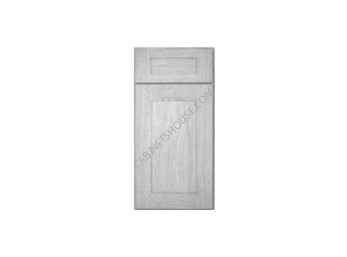 Wall Glass Door with No Mullion and with Clear Glass AN-W1530GD Forevermark Nova Light Grey Shaker